Monte Carlo Comparisons
Topology Monte Carlo Comparisons
A large number of comparisons were made between the data and the Monte Carlo.
For the topology data considered here, the agreement was good.
The comparisons were done cut-class by cut-class. There were 4 cut classes:
vertex (Zvertex and Rvertex), &pi+&pi- mass and pT. Comparisons were done by
applying a basic set of cuts (Npr=Ntot=2, Qtot=0) plus the other cut classes,
and examining the cut variables under consideration. Often, the raw distributions
are shown after a very loose set of cuts (only that there be a vertex); this can be
useful for studying the effects of the cuts on the data.
The efficiency was also studied, and the resolution determined.
Note that pT is an important analysis variable; to study the other variables,
we used a cut pT < 200 MeV/c. Also shown are background studies;
the background is obtained by requiring Qtot&ne 0.
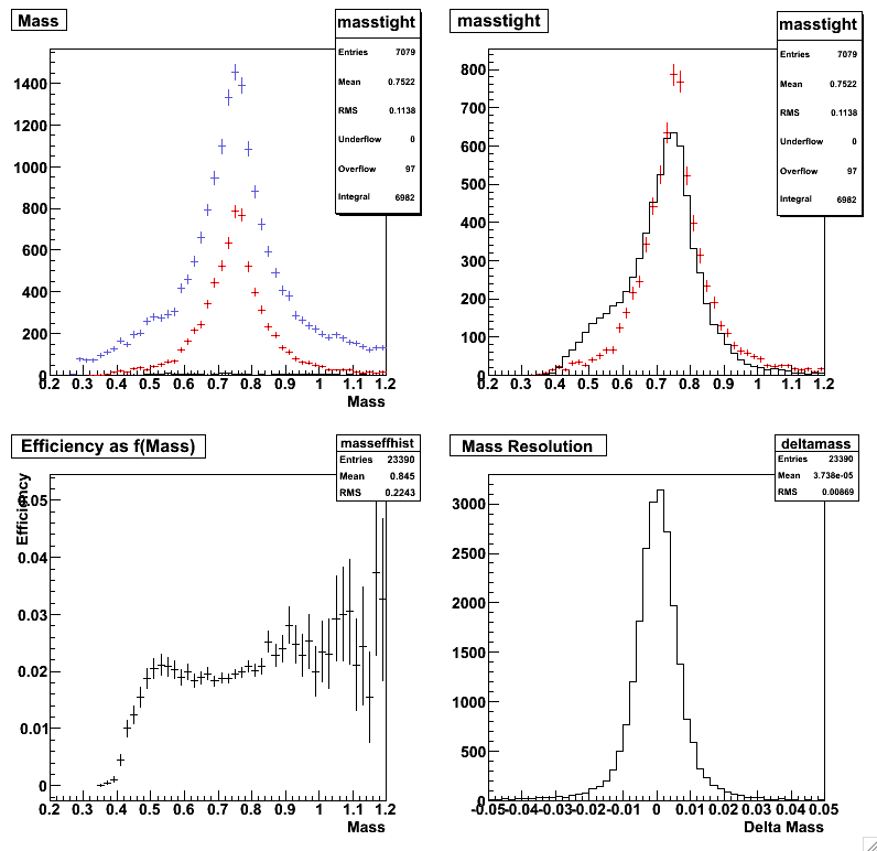
Monte Carlo mass comparisons.
The upper left histogram compares the data with loose cuts (blue),
tight cuts (red) and background (black). A small peak is visible at M(&pi&pi)=M(Ks).
This may be due to photoproduction of the &phi, followed by &phi --> KsKl.
Because the Q value of the &phi decay is so low, most of the KS still make
the pT cut; the KL usually vanishes without decaying. The upper right plot
compares the data and the Monte Carlo; except for the Ks, the agreement is very good.
The lower left plot shows the efficiency; for M&pi&pi > 550 MeV/c, the effiency is flat.
The last plot shows the M&pi&pi resolution of about 8.5 MeV.
 |
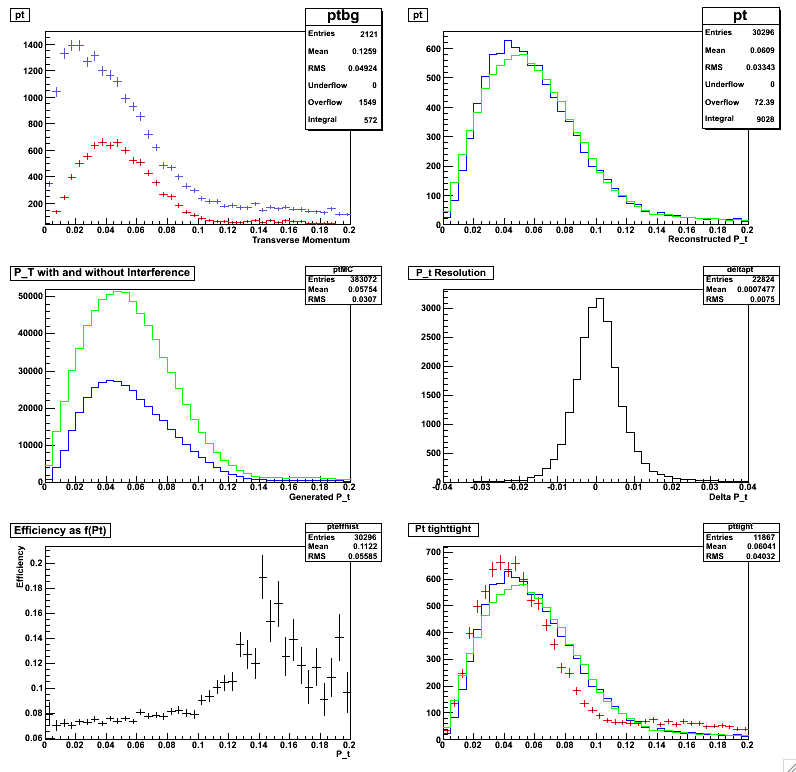
Monte Carlo pT comparisons.
Although the analysis will use t=pT*pT, these histograms give a different
look at the data. The upper left histogram shows the pT spectrum with
loose (blue) and tight (red) cuts; with the tight cuts, there are very few
events with pT > 120 MeV/c. The upper right histogram compares the Monte Carlo
reconstructed pT for 'Int" (blue) and 'Noint' datasets. The middle left histogram
is the same comparison, but for the MC generated pT. The middle right histogram
shows the pT resolution. The peak is symmetric, and &sigma = 7.5 MeV. The lower
left histogram shows the efficiency vs. pT; it is flat except for the first bin,
which is higher due to smearing (this is discussed in terms of 't' in the analysis section.
The lower right histogram compares the data (red), 'Noint' (green) and 'Int' spectra.
 |
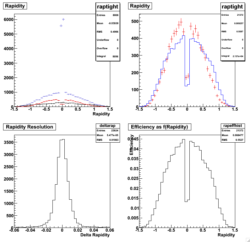
Monte Carlo rapidity comparisons.
The upper left histogram compares the data with loose cuts (blue), tight cuts (red),
and background (with loose cuts). The loose cut plot has a huge enhancement at |y|<0.1;
some of this peak remains even with the tight cuts. This is likely due to cosmic rays,
which are reconstructed as pairs with y=0, pT=0. To remove the cosmic rays,
we only consider events with |y|>0.1. The upper right histogram compares the
data (red) and Monte Carlo (blue). Although there is a very slight asymmetry
between y>0 and y<0 in the data, likely due to the varying CTB slat efficiencies,
the overall agreement is very good. The effect of the slight mismatch will be discussed
in the systematic errors section.
The lower left histogram shows the rapidity resolution, 0.01. This is very adequate
for the analysis. The lower right histogram shows the efficiency as a function of rapidity.
It is not flat, since the probability of a daughter pion being outside the TPC acceptance
rises as |y| rises, but since the data and MC agree well, this is no cause for concern.
 |
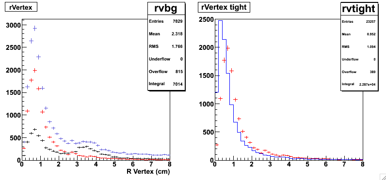
Monte Carlo rVertex comparisons.
The upper left histogram compares the data with loose cuts.
The left plot shows the data with loose cuts (blue), tight cuts (red), and the background (black).
With the loose cuts, a rise is visible at R ~ 3.5 cm; the position of the beampipe.
This completely disappears once tighter cuts are imposed. The background rate is so high
here because there is no cut on z. The plot on the right compares the data (red) and the
Monte Carlo (blue). As with the minimum bias data, the agreement is good.
 |
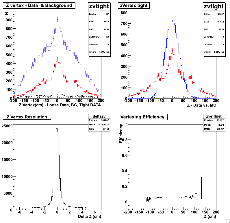
Monte Carlo zVertex comparisons.
The upper left histogram compares the data with loose cuts (blue) and tight cuts (red),
and the background (black). The tight cut data shows side peaks at +/- 75 cm in addition
to the central peak at z=0. This is due to bunching from the 200 MHz RHIC RF system, and
has been seen elsewhere (per Jamie Dunlop). The pT spectrum of data in the side peaks looks
the same as the data in the central peak.
The upper right histogram compares the (red) data and Monte Carlo (blue). The Monte Carlo
zVertex was generated as a Gaussian with width 80 cm. This does not reproduce the detailed
structure in the data, but is a reasonably good overall fit.
The lower right is the resolution estimated with the Monte Carlo (zVertex-zMC);
the resolution is 1.1 cm. The lower left shows the efficiency as a function of zVertex.
It is almost flat within +/- 100 cm.
 |
Same fits without topology trigger simulation here.